Start Simple With Responsive HTML Email Design
In the world of transactional and marketing email, the actual process of coding your content into HTML and CSS has been described as a black art. A large variety of differing email clients rendering your messages, each with a different level of standards (non)compliance, and the need to use arcane HTML authoring techniques (like <table> elements for structuring content) make for a potential minefield of incorrectly-rendered emails.
In the face of this complexity, the prospect of adding mobile/responsive capabilities into your mailings can seem daunting. So here’s a simple, fast way to experiment with including some mobile-specific features into your HTML email. What we’re after here is the very recognizable mobile-responsive feat of stacking two columns on top of each other for better viewing on a mobile device. This won’t get you all the way to a mobile-ready email design but is a good first step.
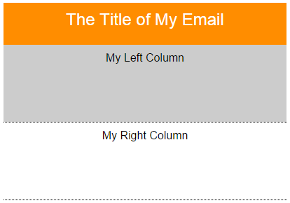
Let’s start with a simple, desktop-ready HTML email structured with <table>‘s:

    <table height="100%" width="100%" border="0" cellpadding="0" cellspacing="0">
        <tr>
            <td align="center" valign="top">
                <table width="100%" border="0" cellpadding="0" cellspacing="0">
                    <tr>
                        <td align="center" valign="top">
                            <table width="600" border="0" cellpadding="0" cellspacing="0">
                                <tr>
                                    <td class="column" width="50%" height="50px" align="center" valign="middle"  style="color: white; background-color: #ff8d00;">
                                        <span style="font-size:24px;">The Title of My Email</span>
                                    </td>
                                </tr>
                            </table>
                        </td>
                    </tr>
                    <tr>
                        <td align="center" valign="top">
                            <table width="600" border="0" cellpadding="0" cellspacing="0">
                                <tr>
                                    <td class="column" width="50%" height="100px" align="center" valign="middle" style="background-color: #ccc;">
                                        <span>My Left Column</span>
                                    </td>
                                    <td class="column" width="50%" height="100px" align="center" valign="middle" style="border: 1px dotted black;">
                                        <span>My Right Column</span>
                                    </td>
                                </tr>
                            </table>
                        </td>
                    </tr>
                </table>
            </td>
        </tr>
    </table>
Getting these columns to stack on a mobile device can be achieved with some CSS in the head of the email:
    @media only screen and (max-width: 480px){
        table {
            max-width: 480px !important;
            width: 100% !important;
        }

        td[class="column"] {
            display: block !important;
            width: 100% !important;
            padding-top: 10px;
            border-left: none !important;
            border-right: none !important;
        }
    }

And with just a few lines of code we have stacking columns! Note the key technique here: A CSS media query targets device-widths below 480px to set a CSS “max-width” property on our <table>‘s and sets our “column” <td>‘s to “display: block” and “width: 100%”.
This is just the tip of the iceberg. You can do a lot more to enhance mobile styles with this technique, but be aware of several caveats. Media query support is quite limited in email clients. While iOS and some native Android clients will recognize them, Gmail clients currently do not. Web-based email clients often strip out the <head> section styles altogether. There’s a lot more to learn about robust mobile email creation and – as always – test, test, test across your target email clients before launching a campaign.


